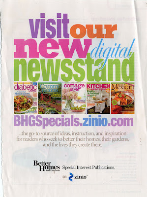
Happy Monday everyone! This week’s ad is from a Better Homes and Garden’s publication. I was drawn to the big title with lots of different fonts and colors.
This is another one of those ones that I think I’ll go back to again. Here’s my first interpretation – I went very simple here, I tried to add more but felt it didn’t work so I took them off.
I’m so proud, I finally dug into my stash and used some of the Bo Bunny dot paper (orange) that I’ve had in my stash forever but hadn’t used!
What do you think? Does this ad inspire you? Link me up if it does, I love to hear what you think.


Now there's a brilliant page! I like yours better than the original – it all hangs together really really well.
This is fantastic, Paula! Love the banner on the kraft. Cool title lettering. Wicked awesome page.
Hugs,
Brandi
Paula, I love this. I mean, EVERYTHING about it. Simply a perfect page. You're a goddess.
I luv your ideas and how you adapt them to projects. You have inspired me and thank you for visiting my site.