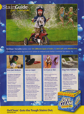
I’m baaa-ack! And so is the ad challenge! This week’s ad is very linear with room for at least 5 photos.
I was inspired by the larger photo on the top and the smaller photos underneath. The ad has columns of text underneath the smaller photos but I switched things up and filled those spaces for patterned paper. I also liked the positioning of the title and the accent down in the bottom right. Here’s my take:
 |
| Supplies from Designer Digitals |
As always, I love to hear from you — let me know if you do use the ad, I’d love to see how it inspires you!


Fabulous LO! I really wanna give this one a whirl. Thanks for the inspiration. 🙂
I really like this one too and I like that your interpretation made room for patterned papers 🙂 The subject of the ad would even make a good page! Thank you for the inspiration!
Yay! I'm so glad you're back!
I saw your post at Write.Click.Scrapbook and love the idea of a weekly ad challenge! You have a new follower!
oh paula! you are so good at adapting these ads!
just want to let you know, your blog and the ad inspiration is part of my "survive the empty nest" plan! I'll need to start that in a couple of weeks! LOL!